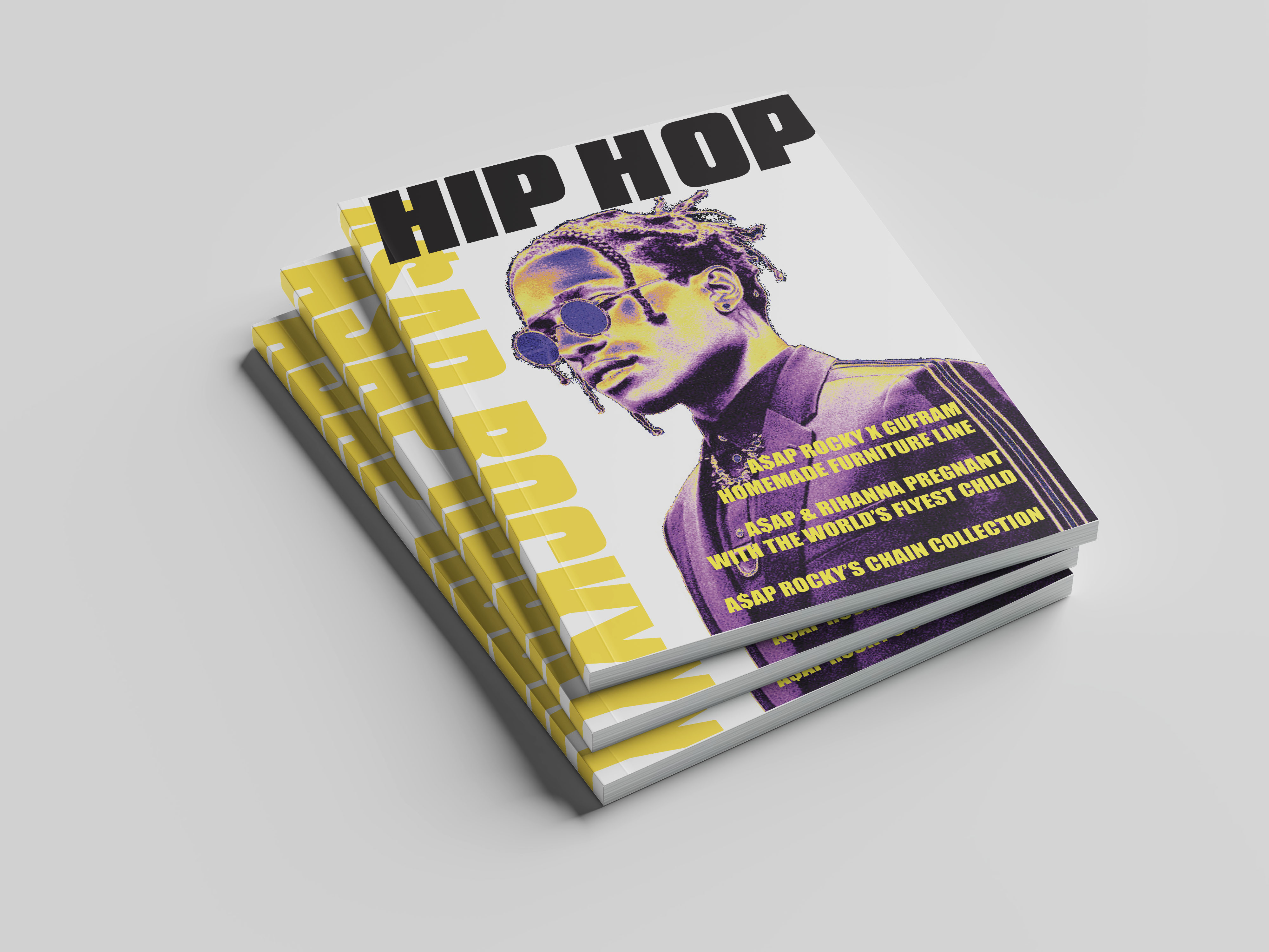
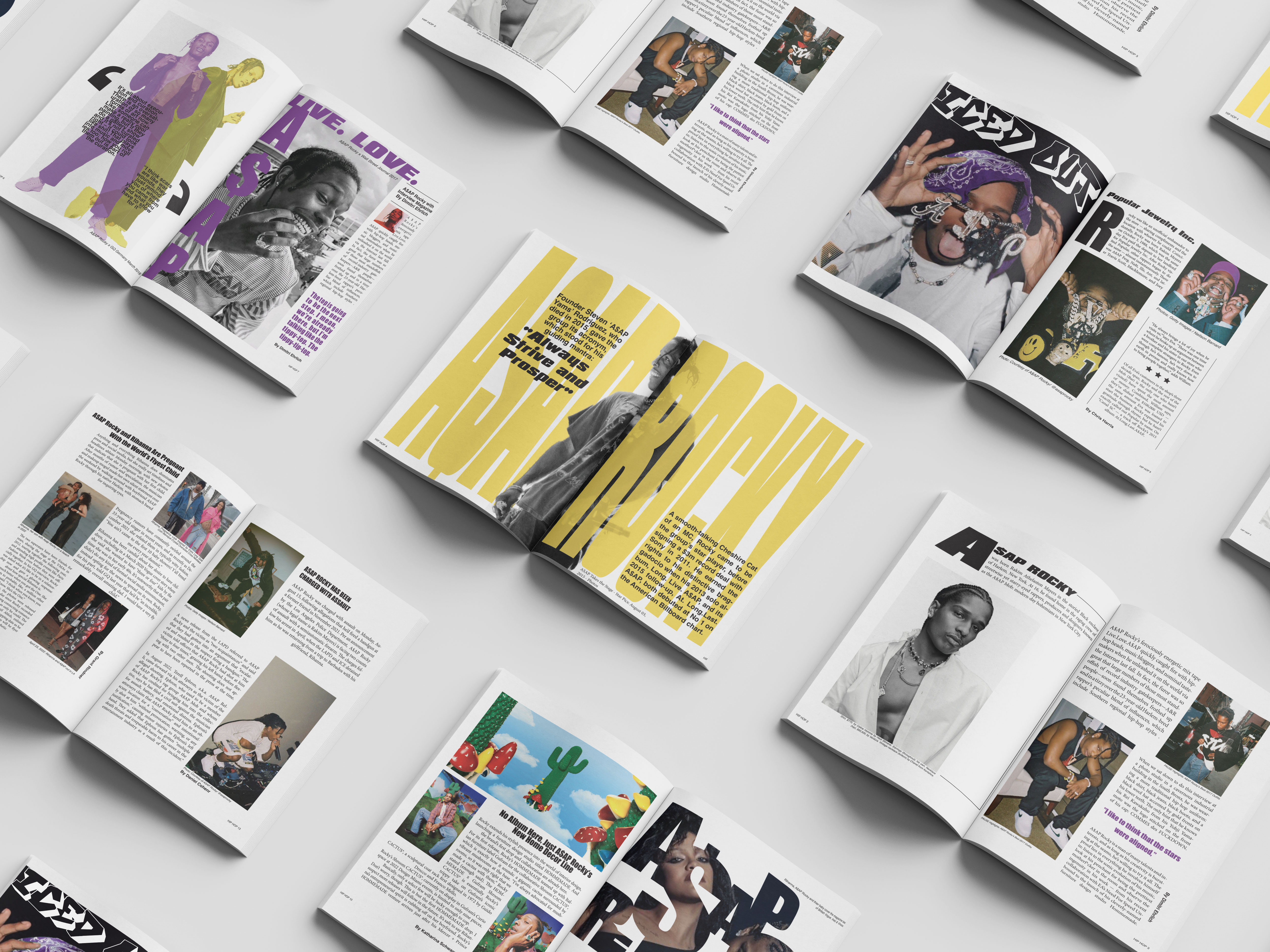
A$AP Rocky Magazine
One of my favorite projects from my graphic design classes is this magazine layout featuring A$AP Rocky. I had a lot of fun designing the layout and creating cut-outs and colorful images of A$AP Rocky.
Project Highlights & Key Features
Creative Layouts
Dynamic page compositions that focus on balance and tension.
Image Editing with Color Manipulations
Custom magazine cut-outs and colorful image manipulations
Typography
Bold typeface selections and intentional hierarchy through text size and placement
Color Palette
Vibrant colors that reflect the artist's aesthetic
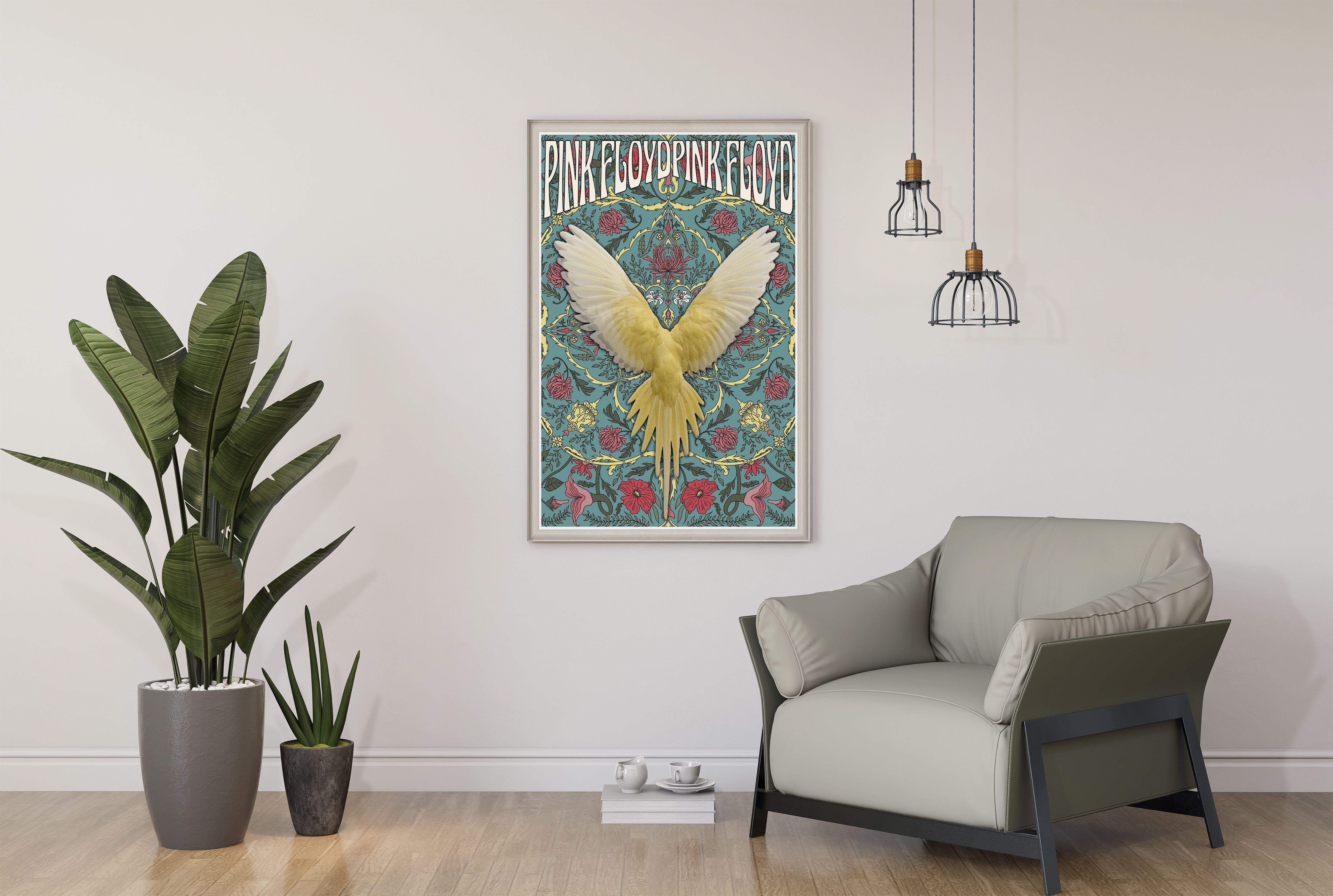
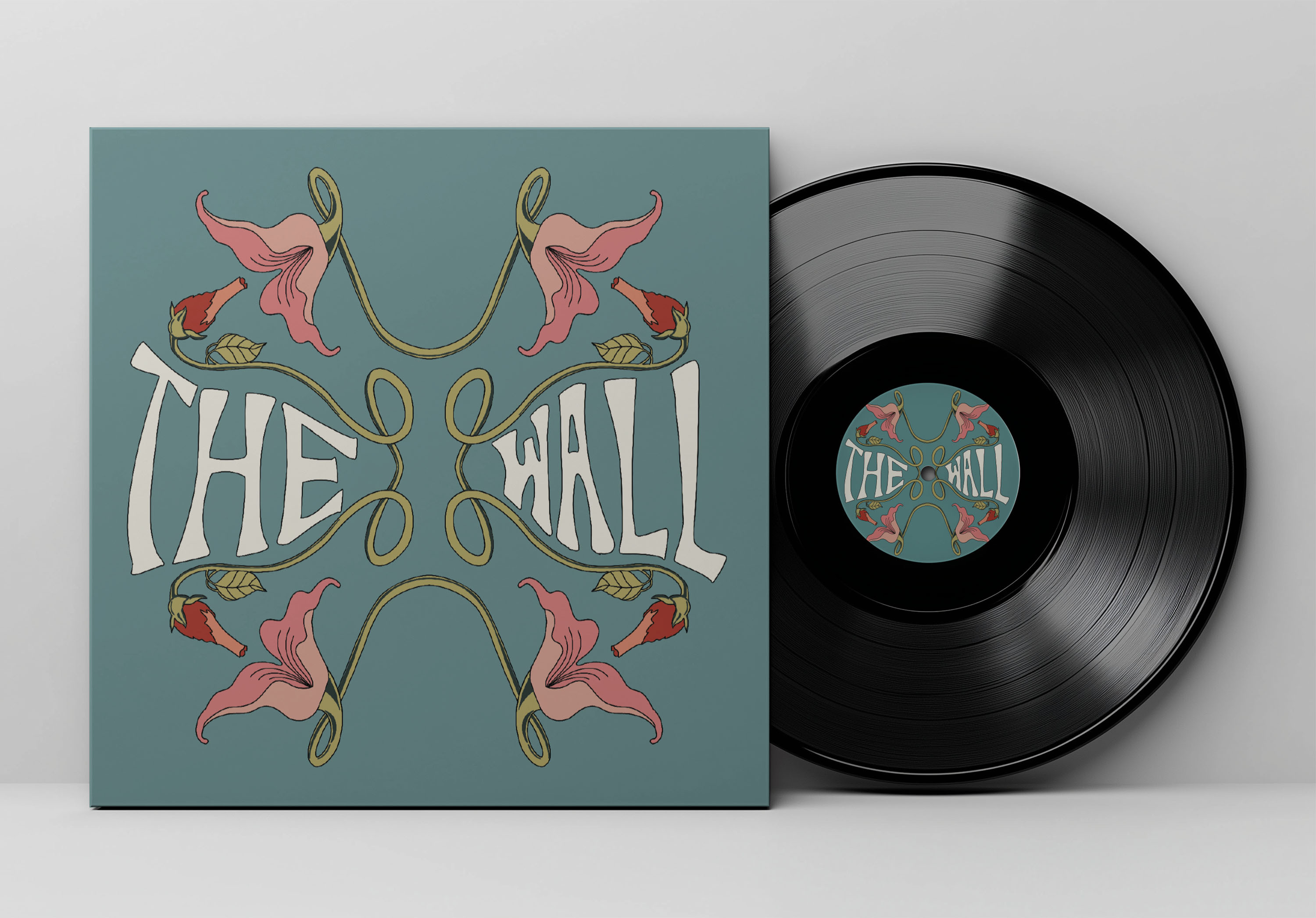
Pink Floyd Poster
This concert poster design explores psychedelic aesthetics and experimental typography inspired by Pink Floyd's iconic visual identity. The project challenged me to blend retro design elements with modern composition techniques.
Project Highlights & Key Features
Psychedelic Design
Visual elements that capture Pink Floyd's experimental music and artistic vision
Experimental Typography
Custom typeface created in Procreate. Creative text treatments that push boundaries while maintaining legibility
Bold Composition
Balanced layout that guides the eye and creates movement and depth
Art Nouveau Style Background and Decorative Elements
Vintage-inspired design merged with modern techniques for a timeless feel
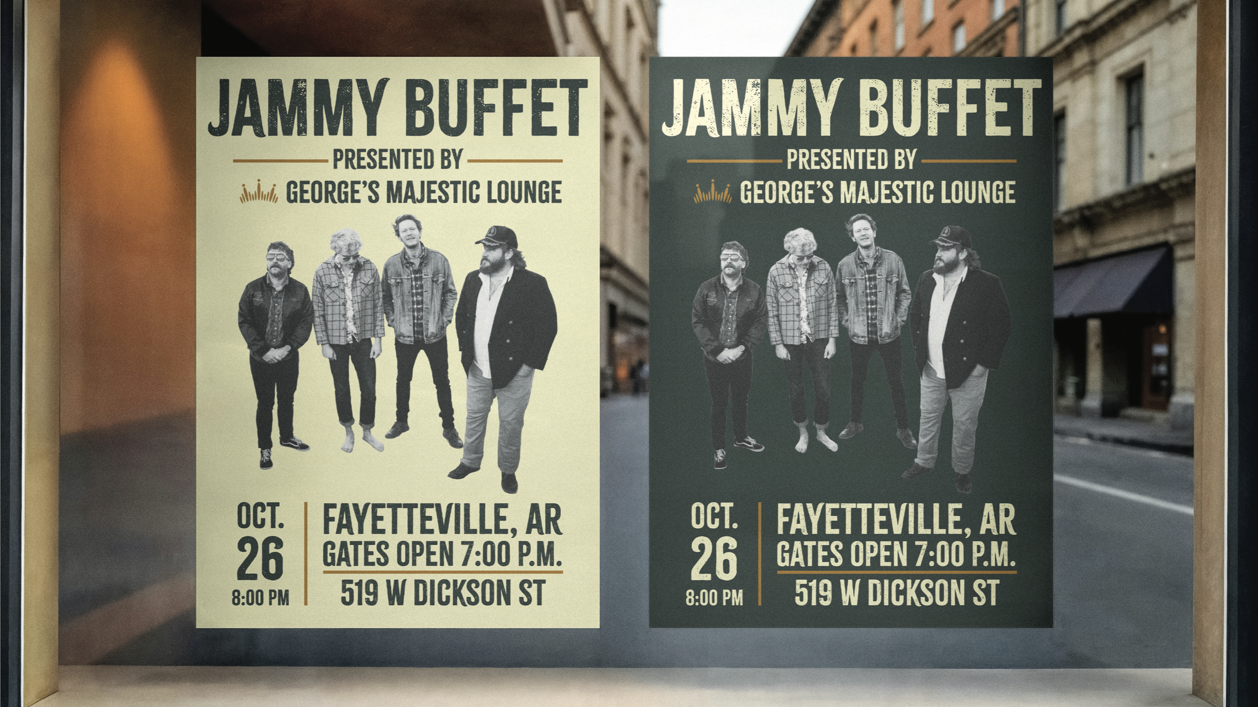
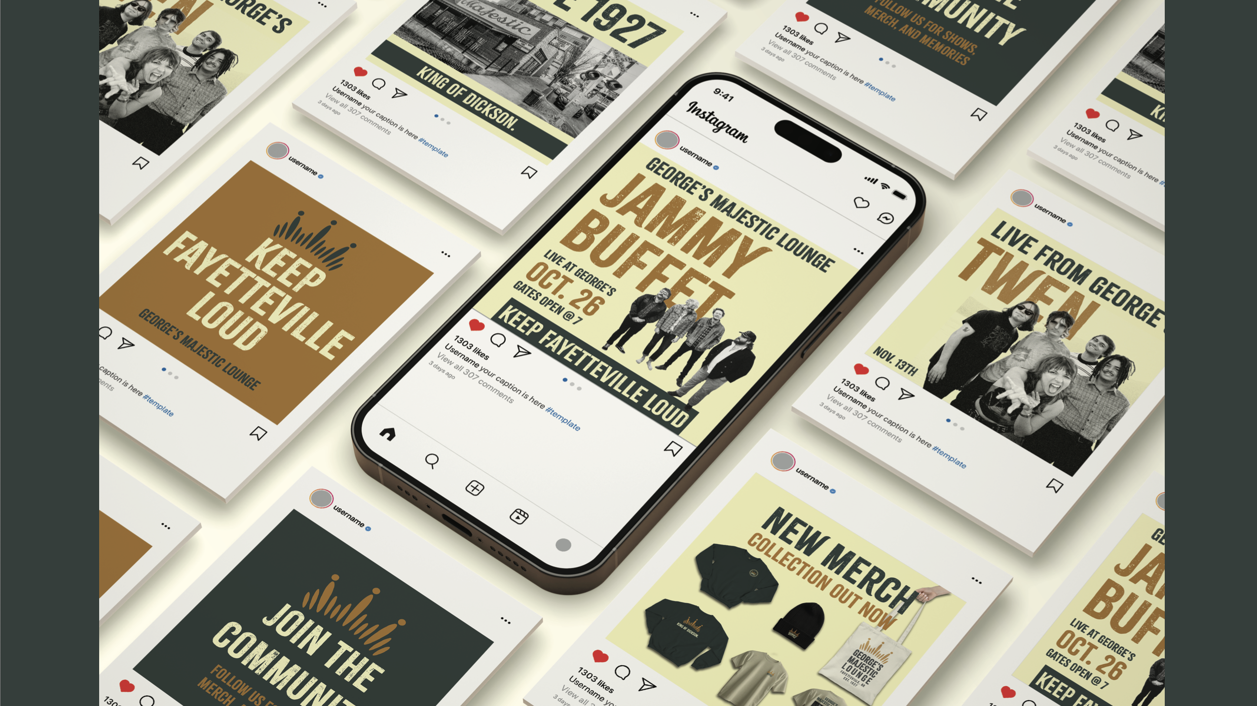
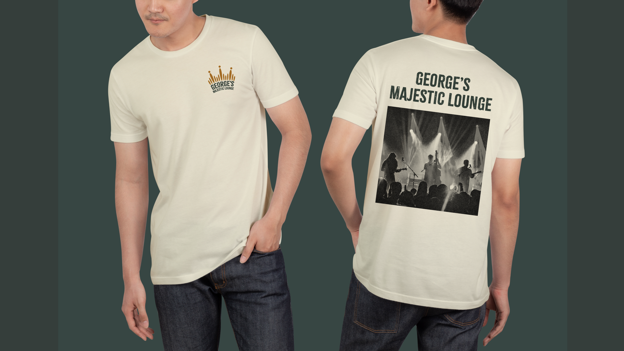
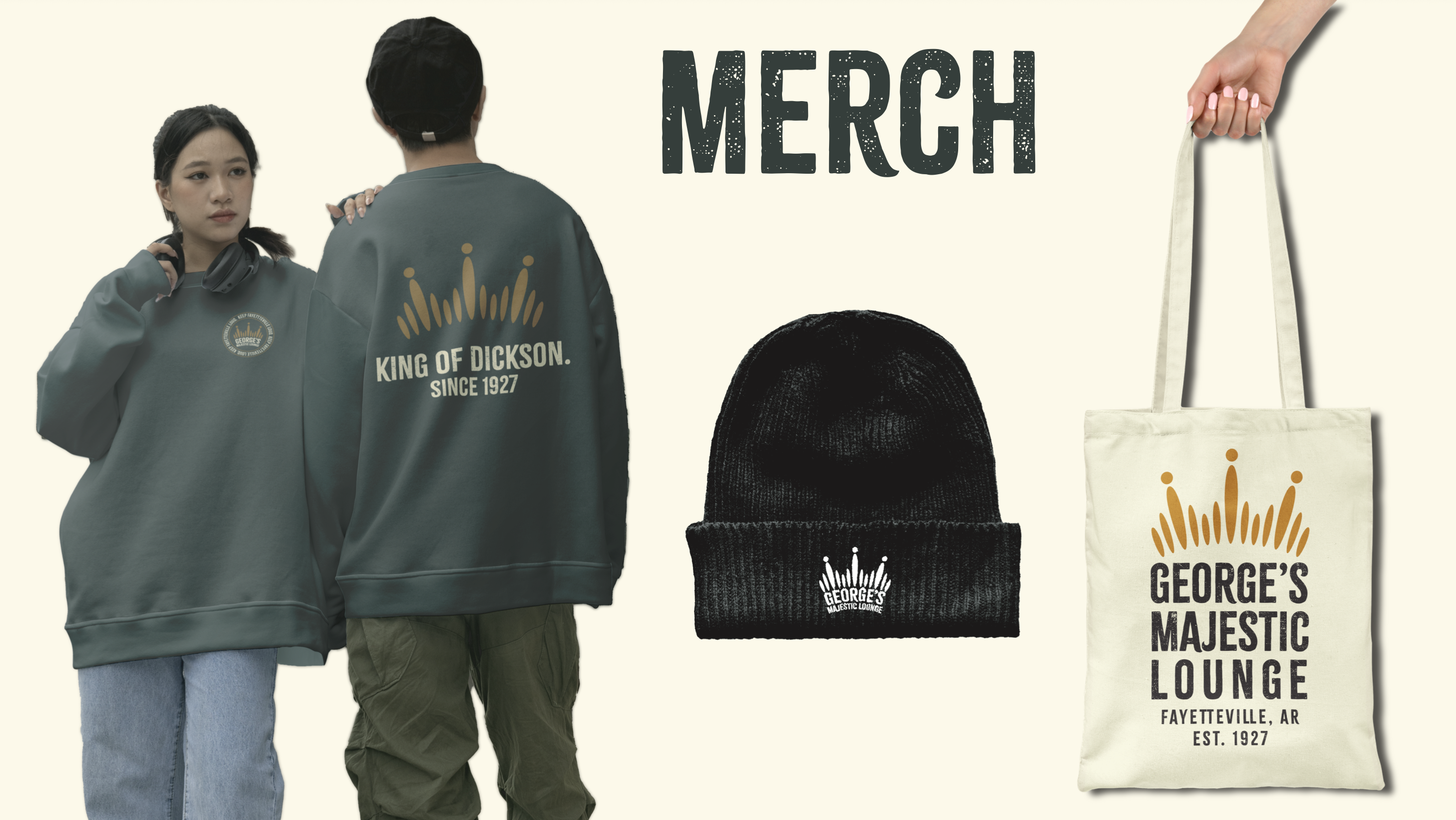
George's Brand Identity
Developing a new brand identity for George's Majestic Lounge increased my knowledge of identity systems and the brand itself. I learned the process of developing a brand identity and the work that goes into it including research, sketching, and designing based on George's previous identity.
Project Highlights & Key Features
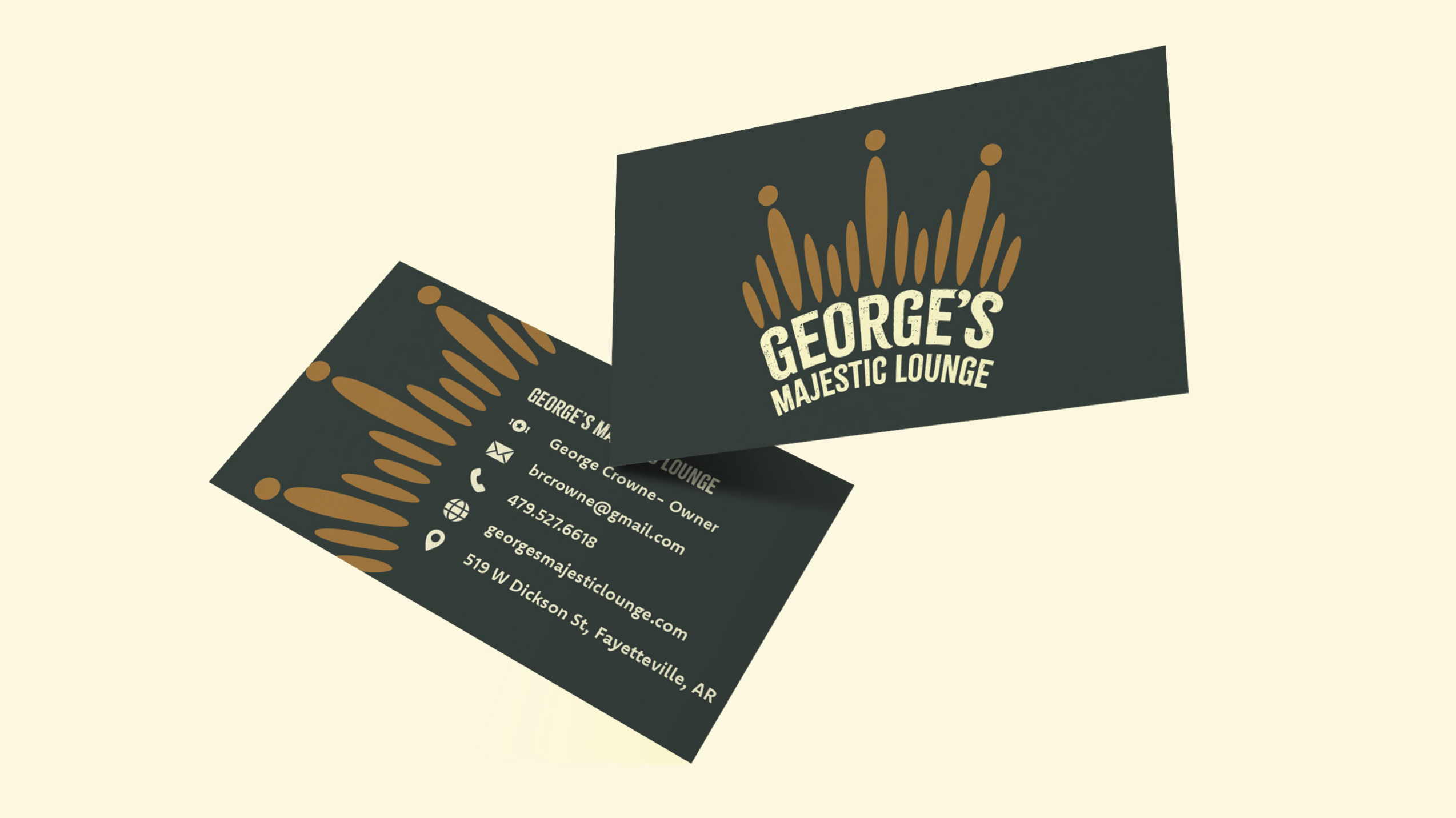
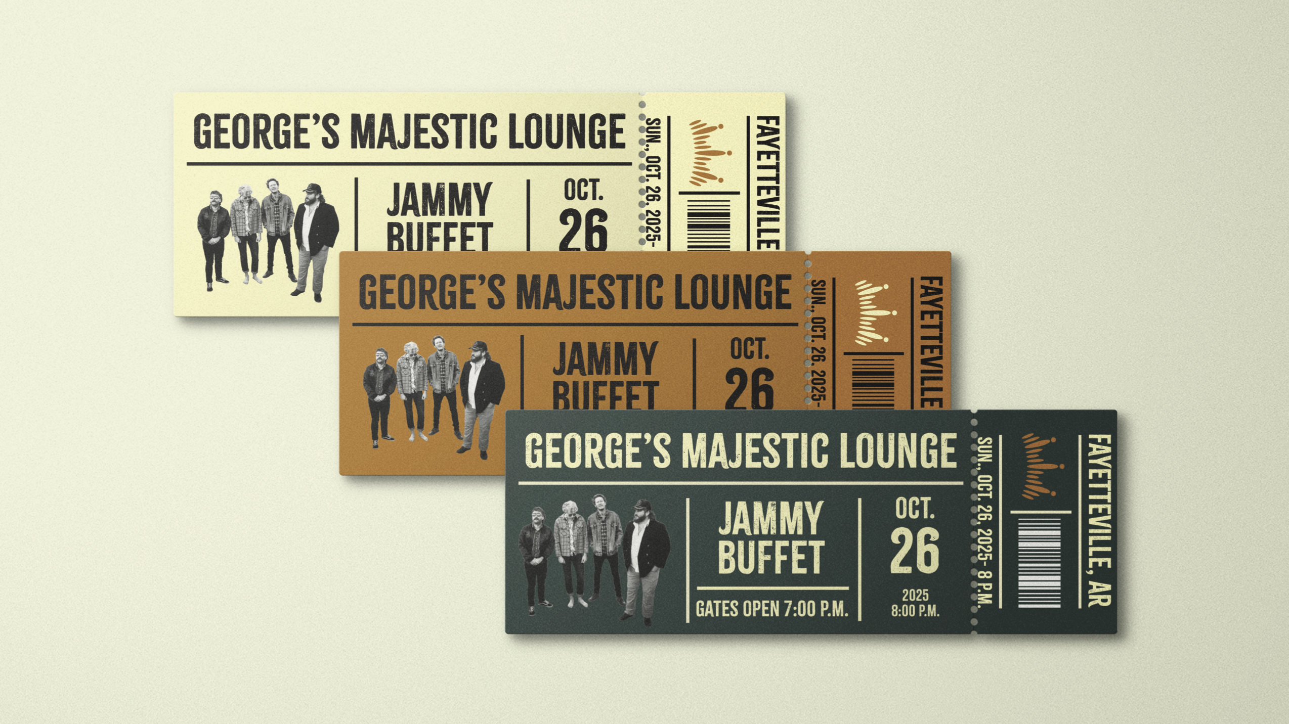
Logo Design
A versatile mark that works across digital and print applications
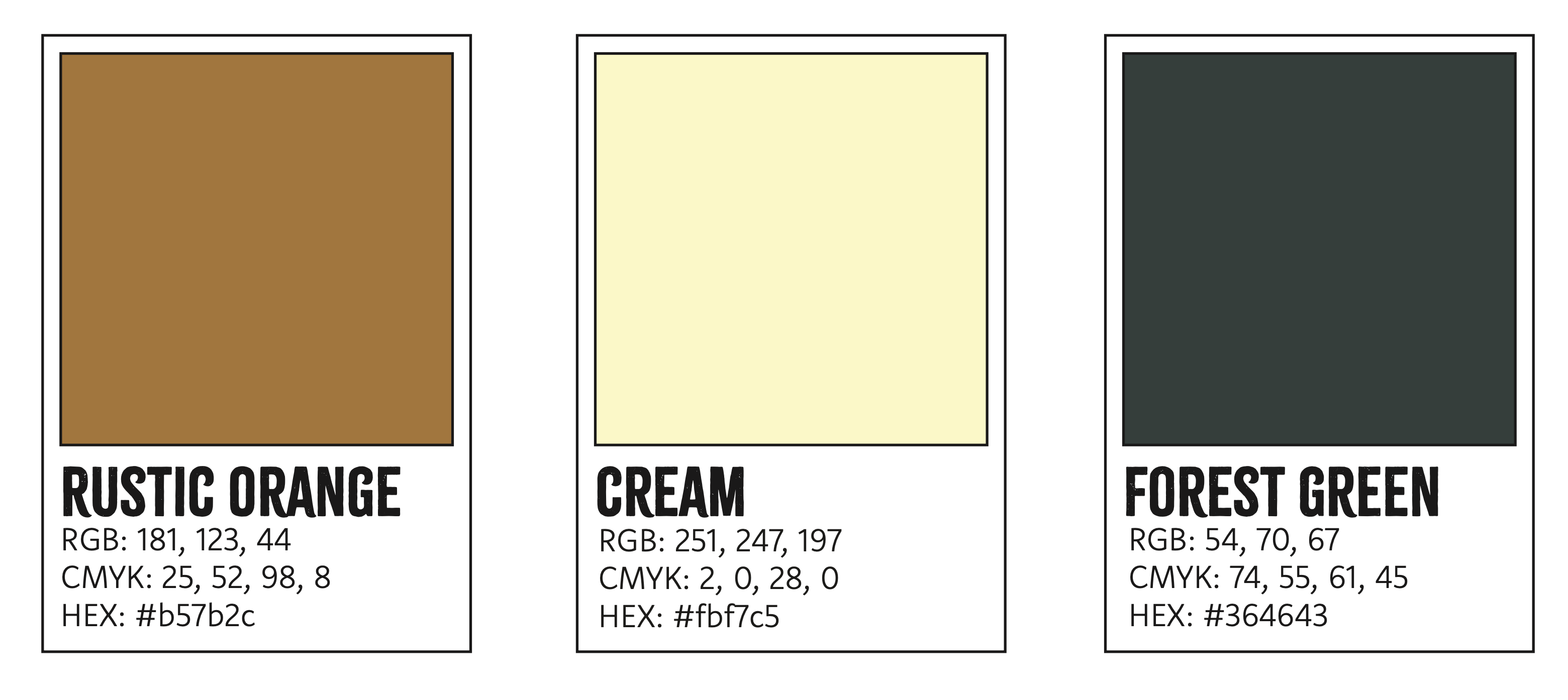
Color System
Carefully curated palette with cream, forest green, and rustic orange
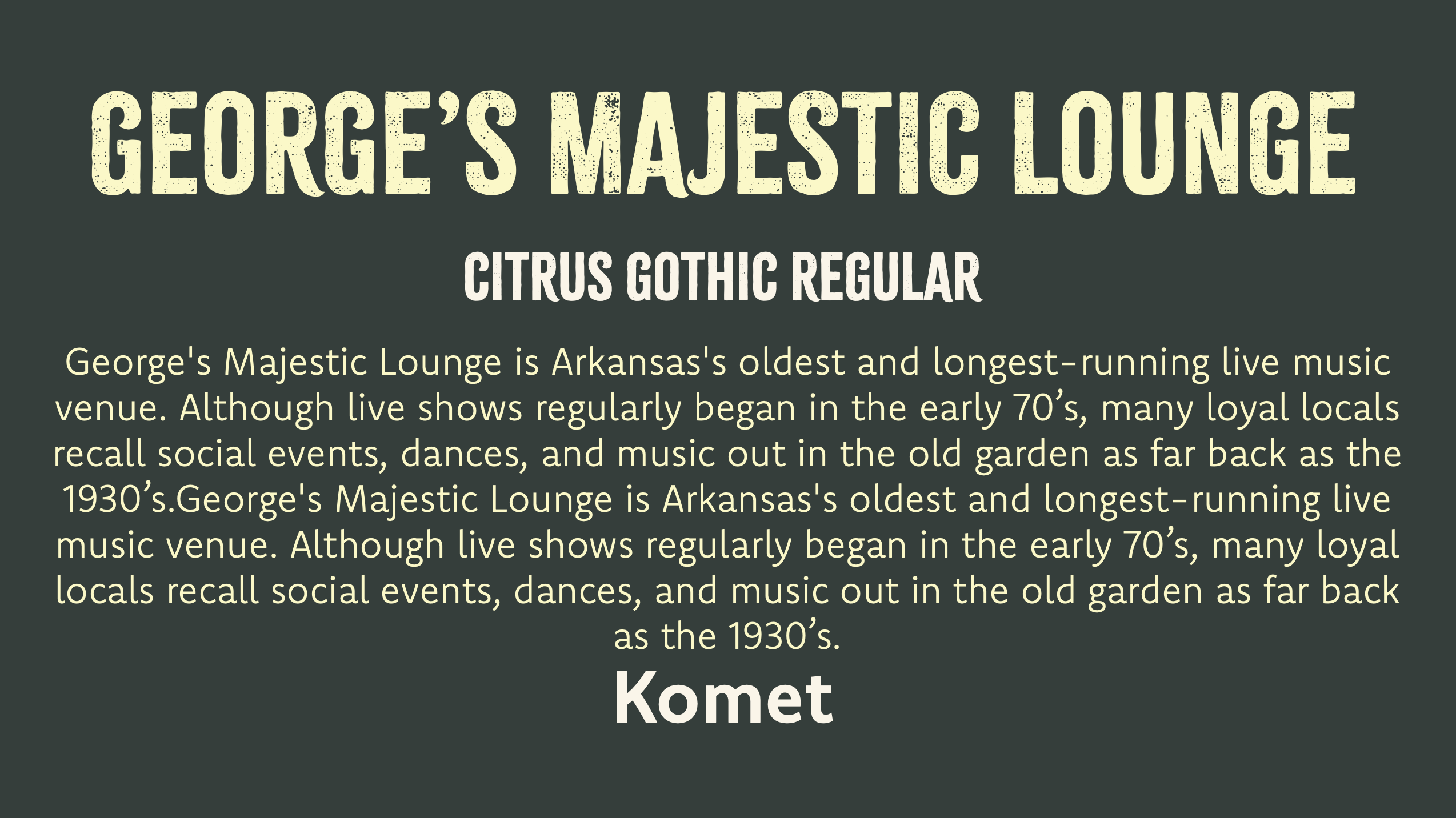
Typography Pairing
Harmonious combination of a bold, decorative font and sans-serif fonts for hierarchy
Brand Consistency
Cohesive visual system applied consistently across all touchpoints
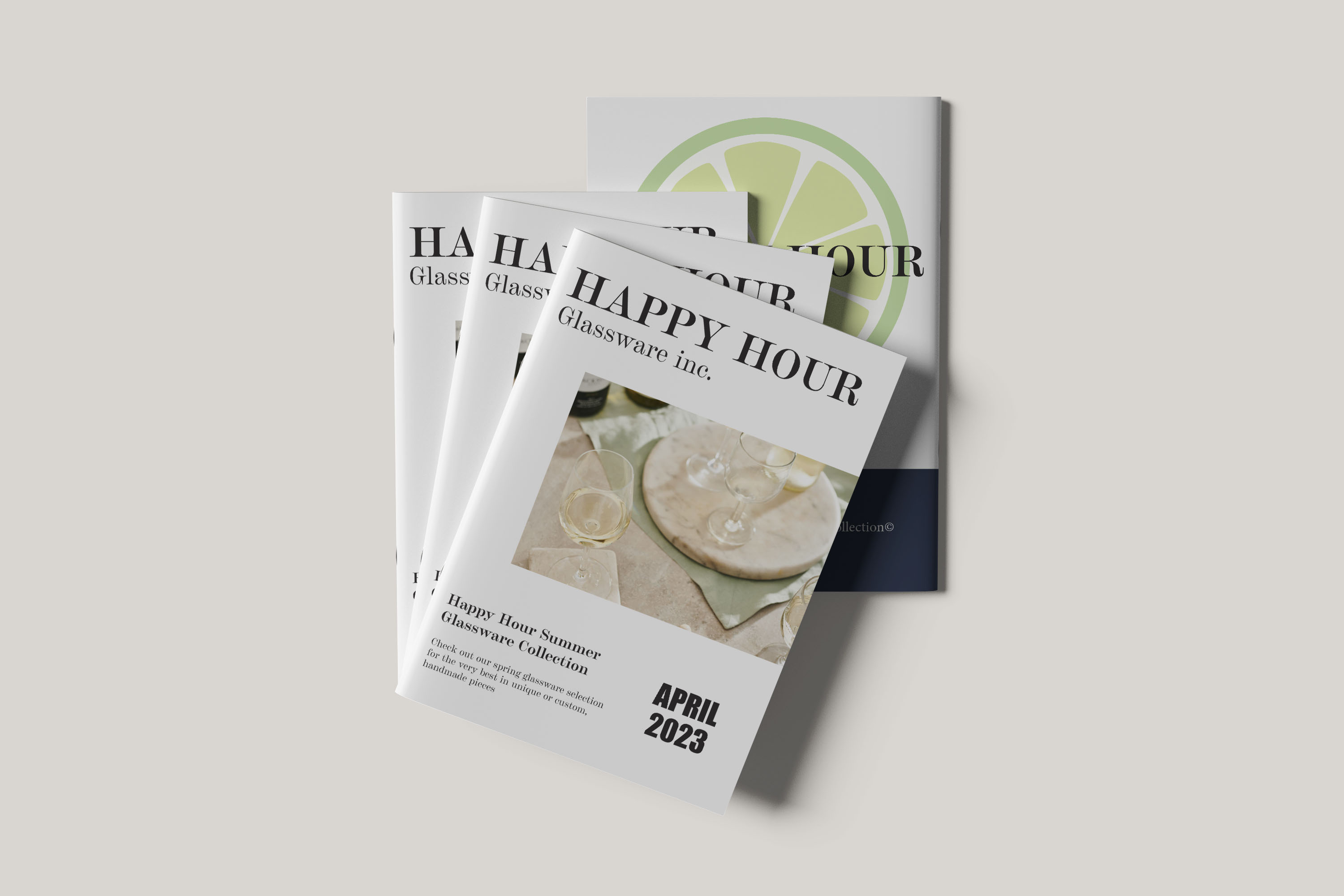
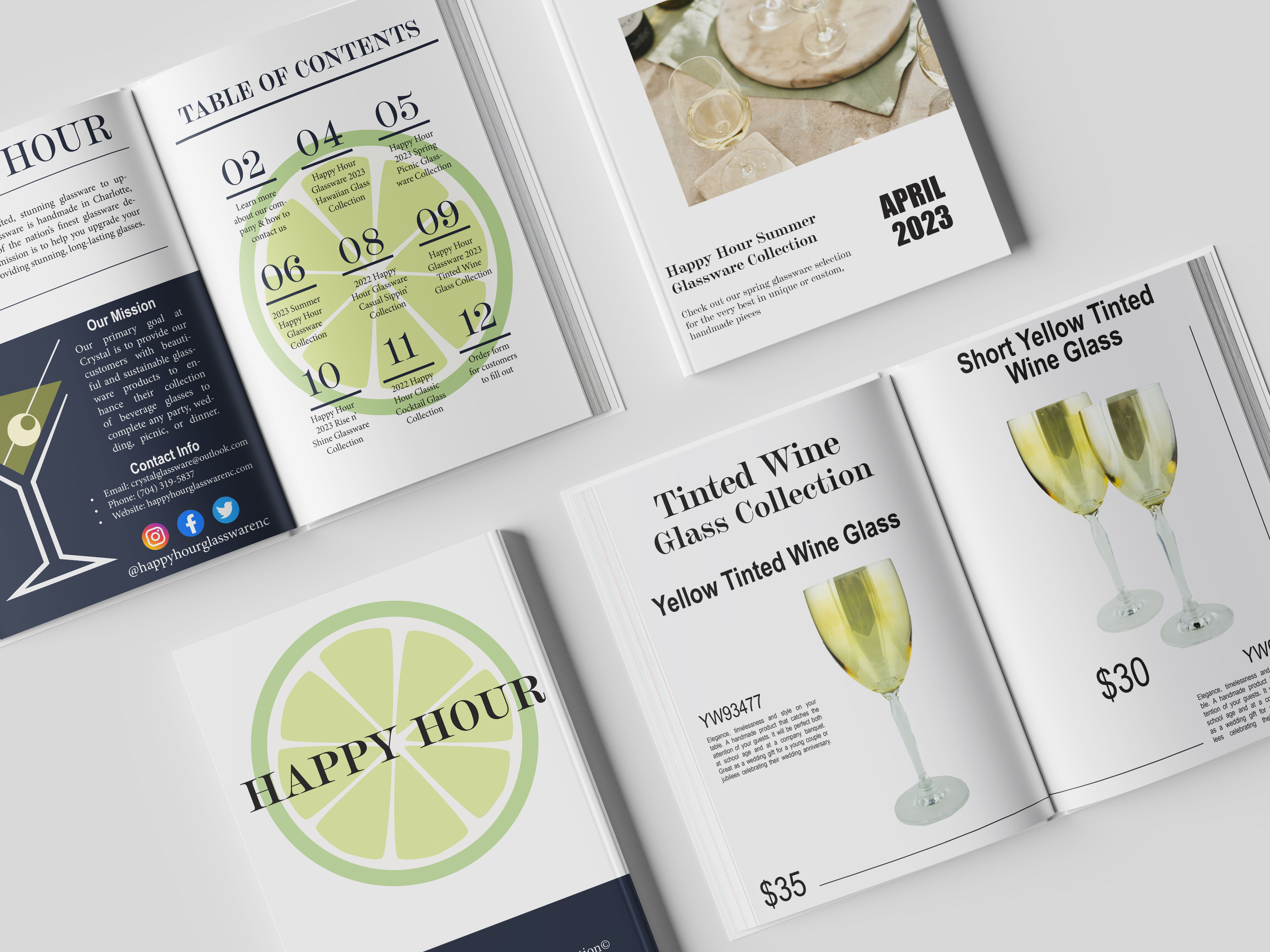
Happy Hour Catalog
A comprehensive product catalog for a premium glassware manufacturer. All of the images were taken in a photography studio with a professional camera.
Project Highlights & Key Features
Grid Layout
Flexible grid system that allows for varying product sizes while maintaining a consisten visual rhythm throughout the catalog.
Color-Coded Pages
Developed a subtle color-code system for different glass categories like wine and cocktail glasses, allowing customers to easily find what they're looking for.
Photography
High-contrast, close-up images to elevate the product from a commodity to a premium craft item.
Typographic HIerarchy
Used a mix of elegant serif and sans-serif headers to ensure that the titles and descriptions are readable at small sizes, and to enhance the hierarchy of the layout.
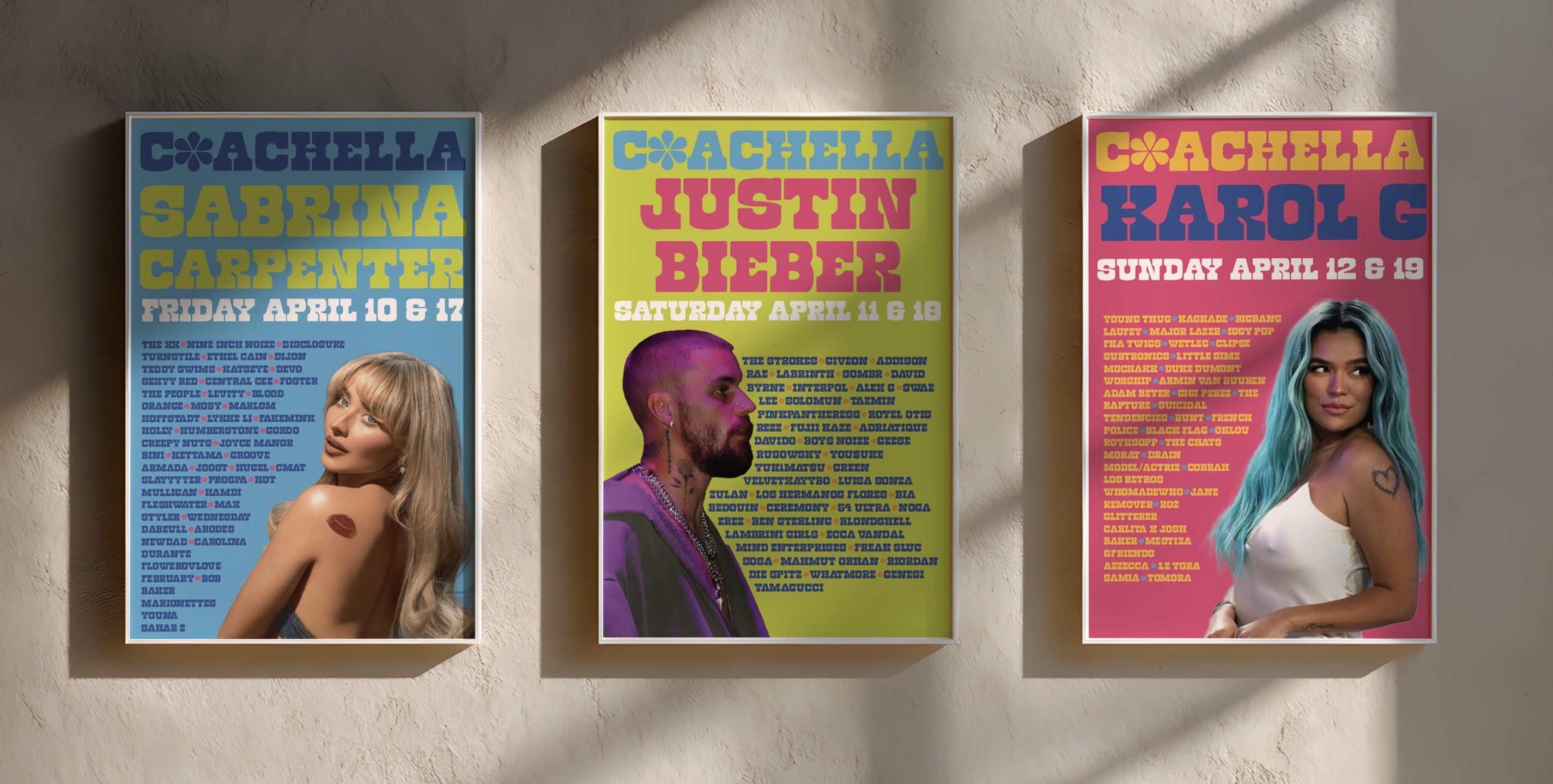
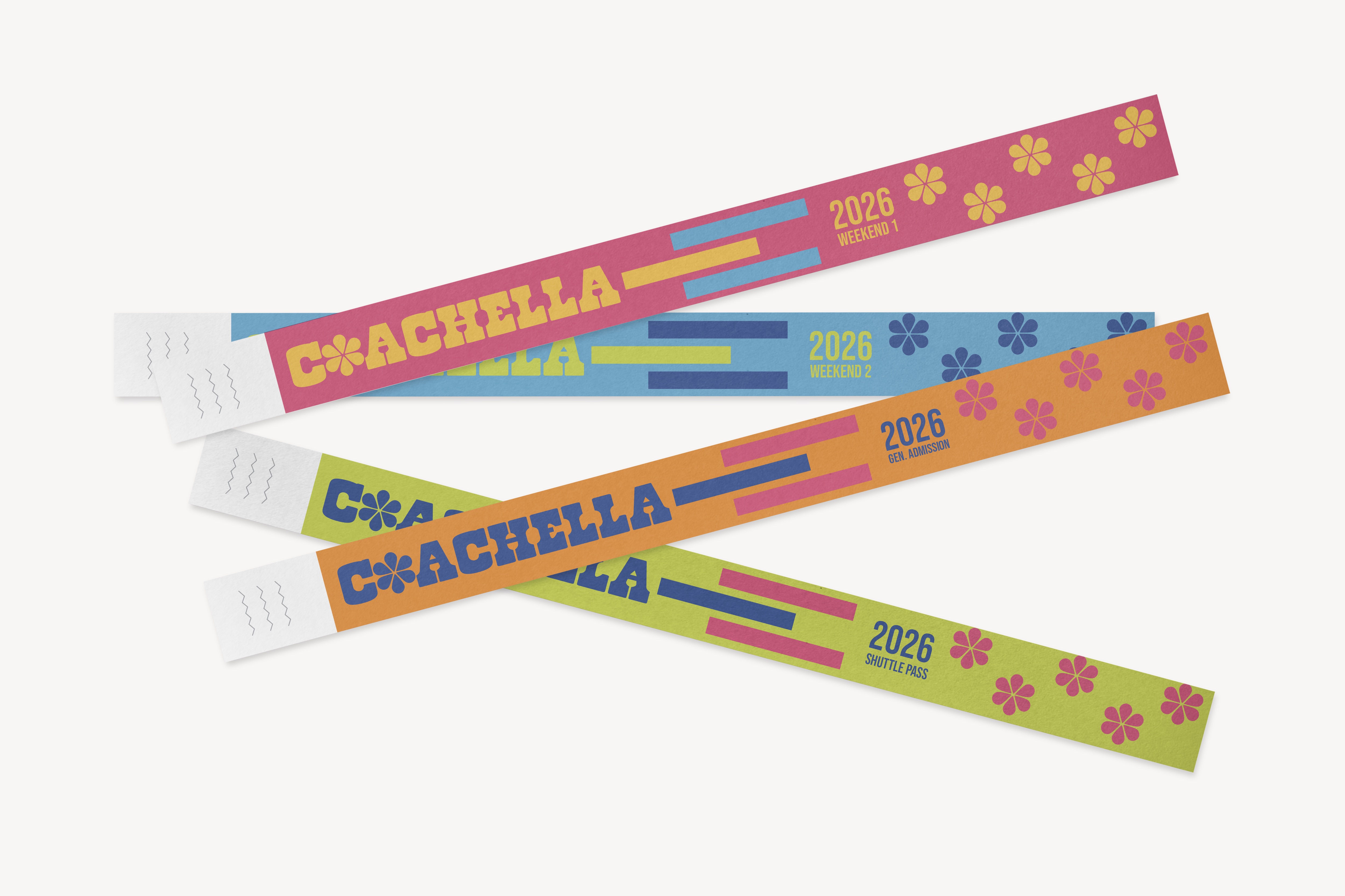
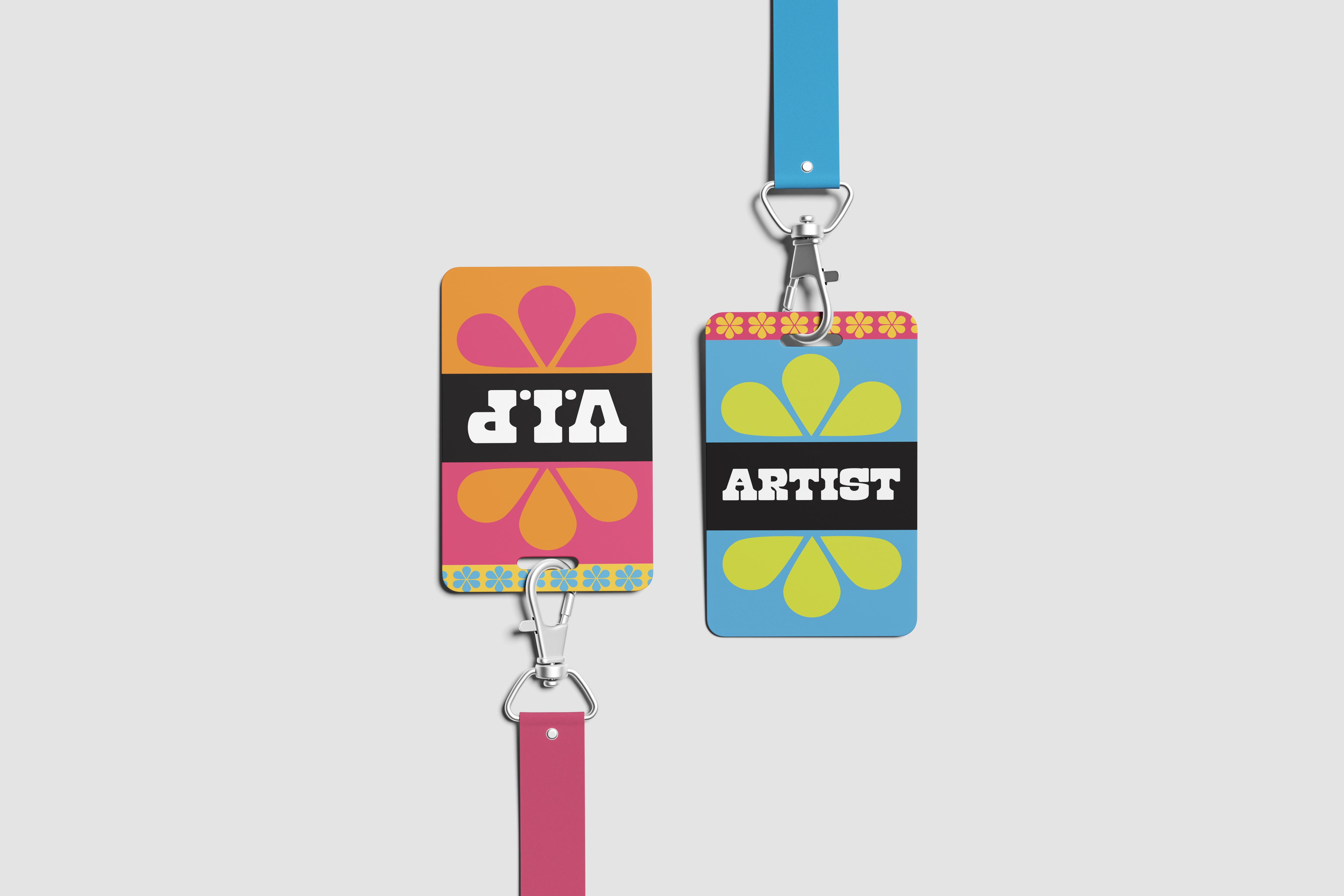
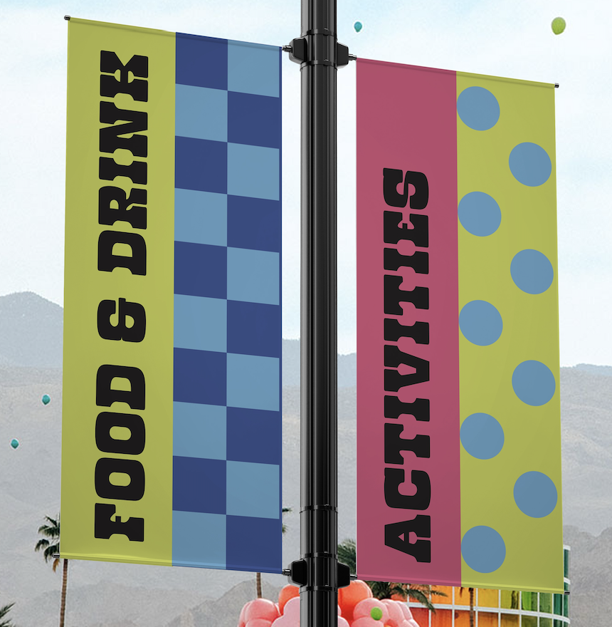
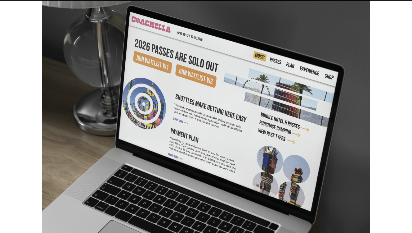
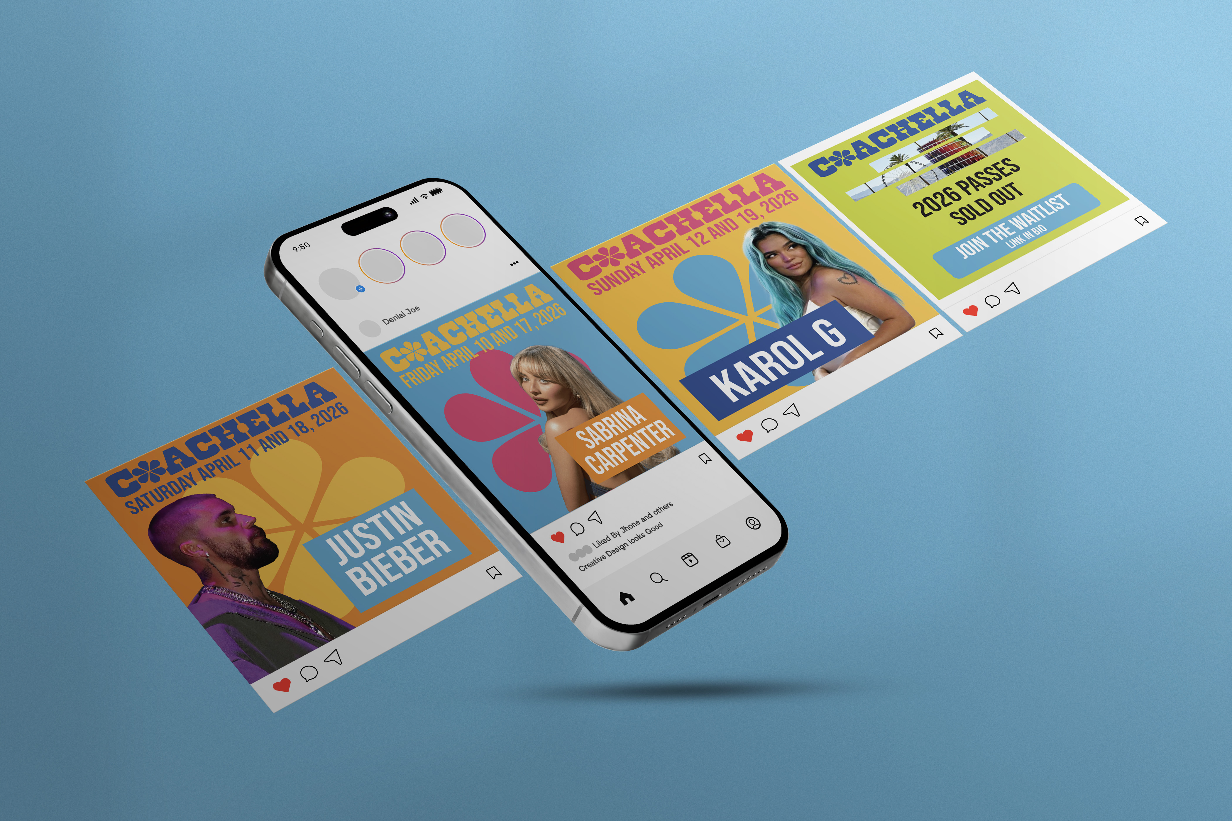
Coachella Rebrand
A vibrant visual identity for Coachella, designed to work seamlessly for any platform from mobile screens to large wayfinding signs.
Project Highlights & Key Features
Typographic System
Selected typeface that are scalable and help to create a visual hierarchy.
Vibrant Color Palette
Combined electric blues and pinks with earthy forest tones to reflect the festival's vibrant feel and desert location.
Dynamic Wayfinding
Designed a suite of banners and wayfinding signage for food, stages, and event centers.
Motion Assets
Developed a stop motion asset that consists of the elements and shapes that I created for this brand.
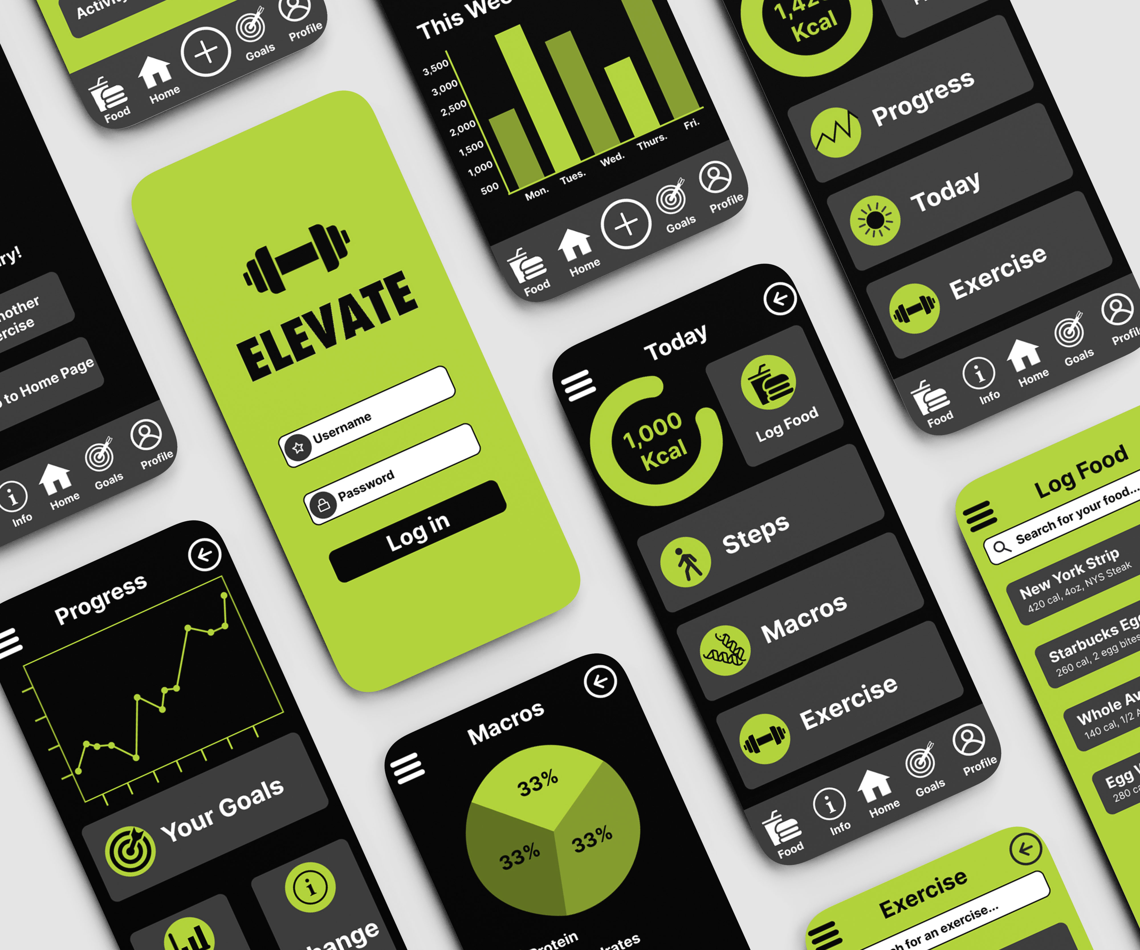
Fitness App: Elevate
Mobile interface design for an app I created called "Elevate", focusing on making the users' fitness journey more fun and enjoyable.
Project Highlights & Key Features
Frictionless Data Entry
Designed an interface with larger touch targets, ensuring users can record sets, reps, and food quickly even with sweaty hands.
High-Contrast Palette
Vibrant neon green paired with black to give it an energetic feel and make the design high-contrast and accessible.
Field Research
Performed research and interviews with participants who tested my design. Recorded these interviews and developed the app based on the critique from users.
Visual Feedback
Progress graphs are designed to encourage the user to continue with their fitness journey.
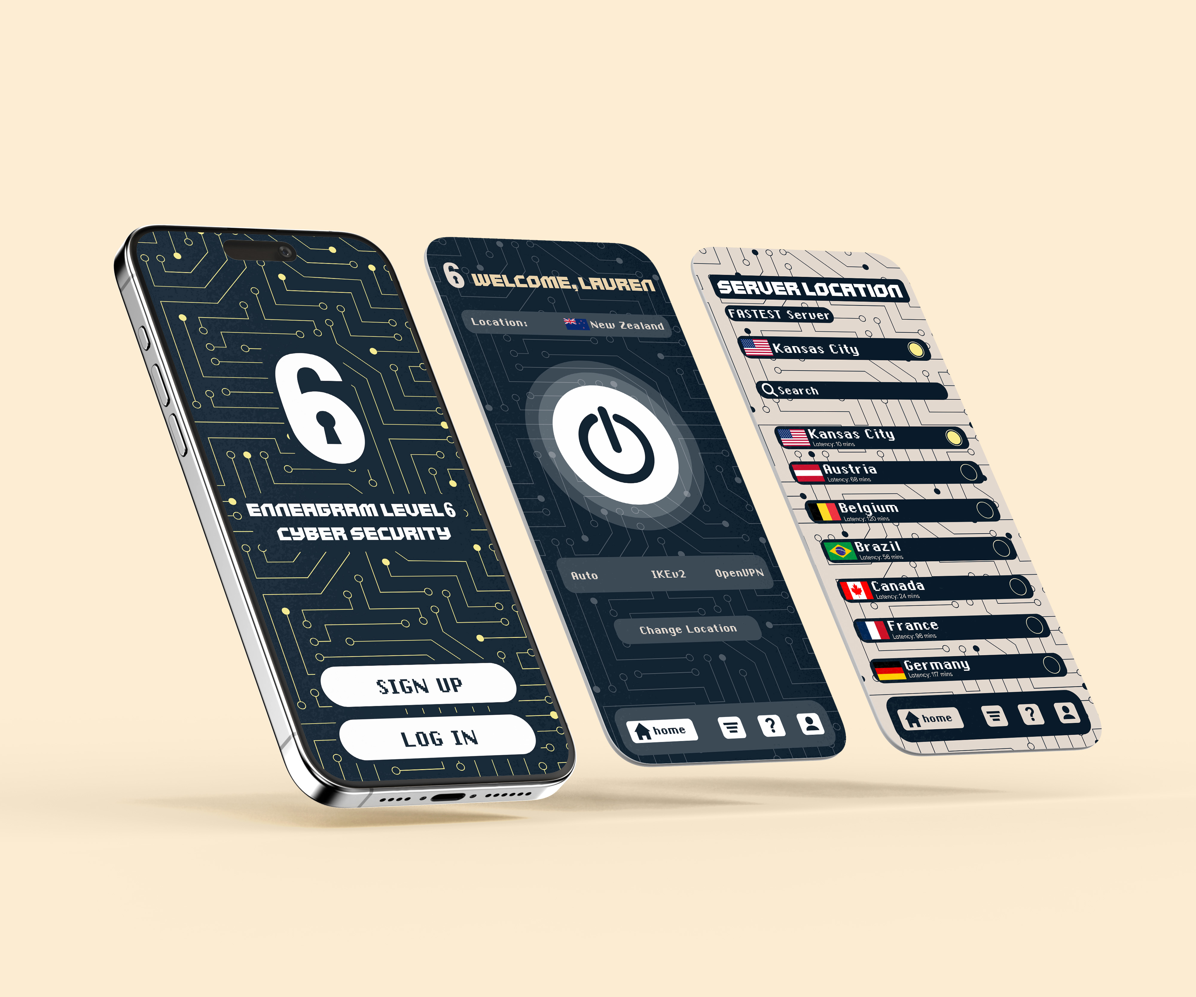
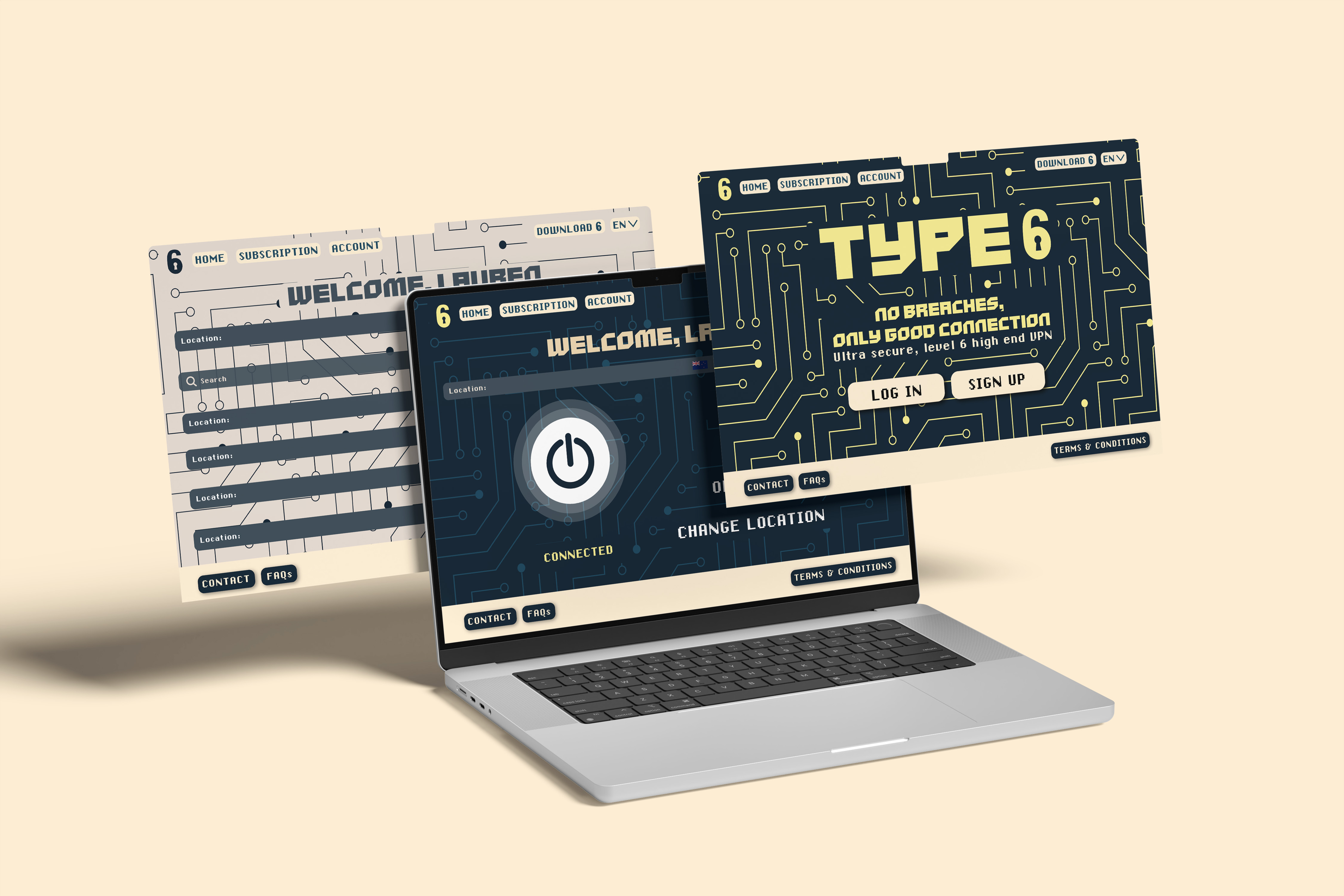
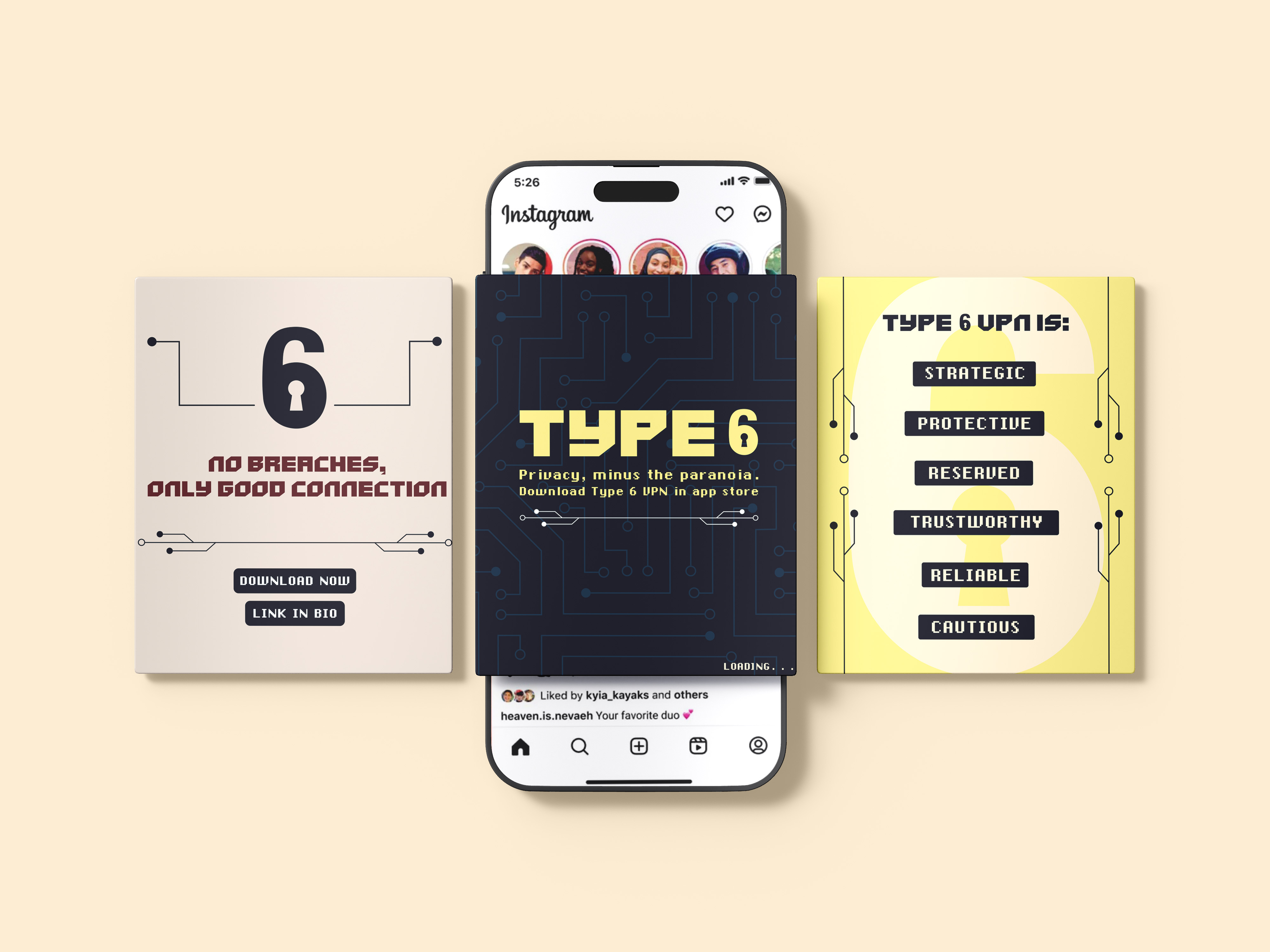
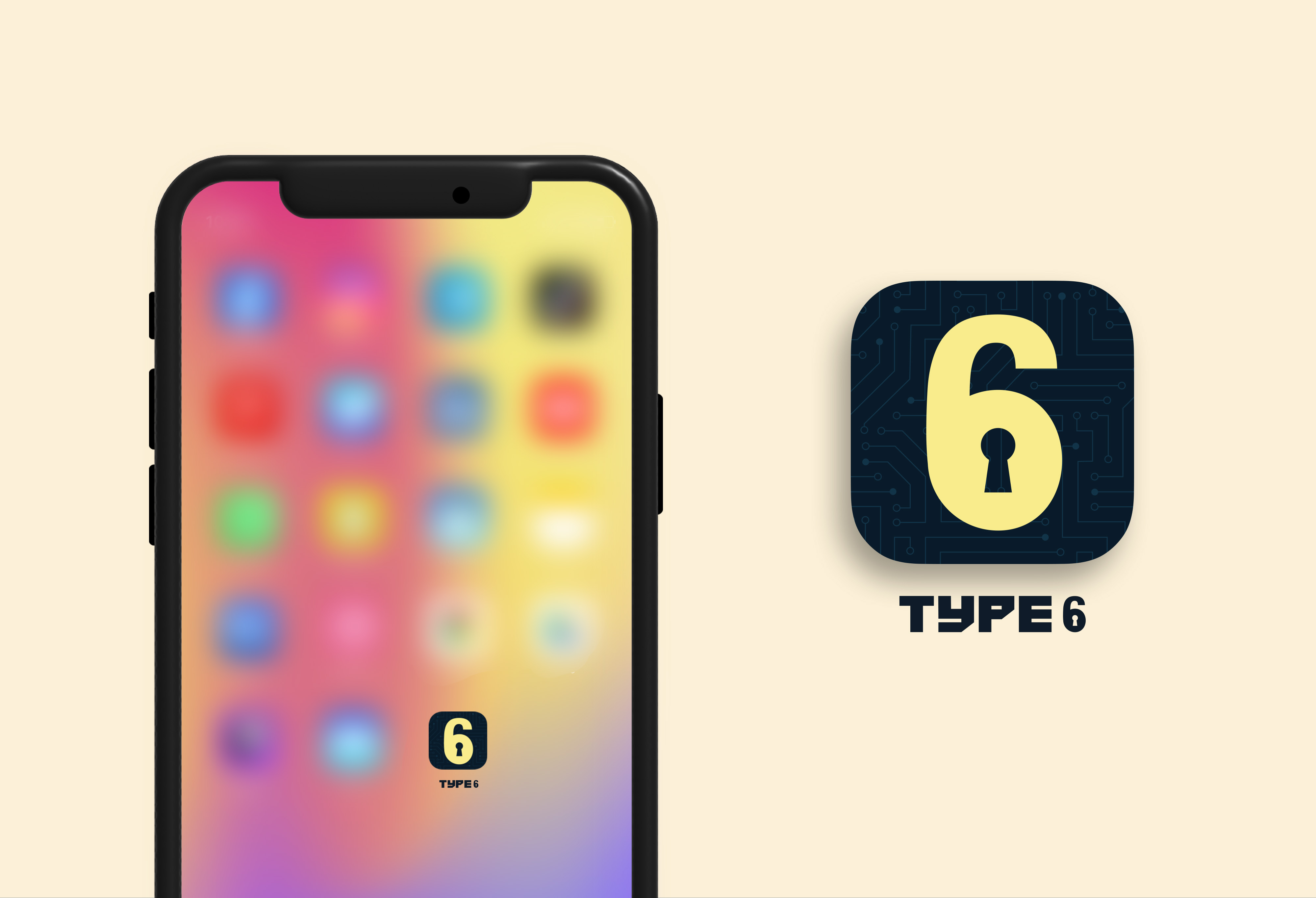
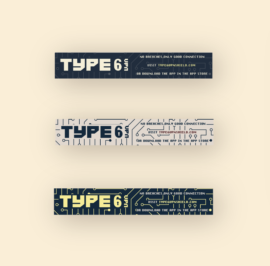
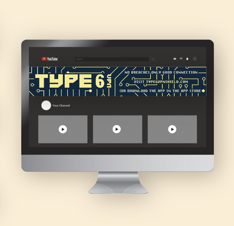
Enneagram Type 6 VPN App
A clean and modern brand identity for a VPN app based on the Enneagram Type 6 personality.
Project Highlights & Key Features
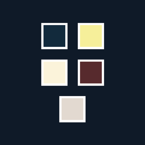
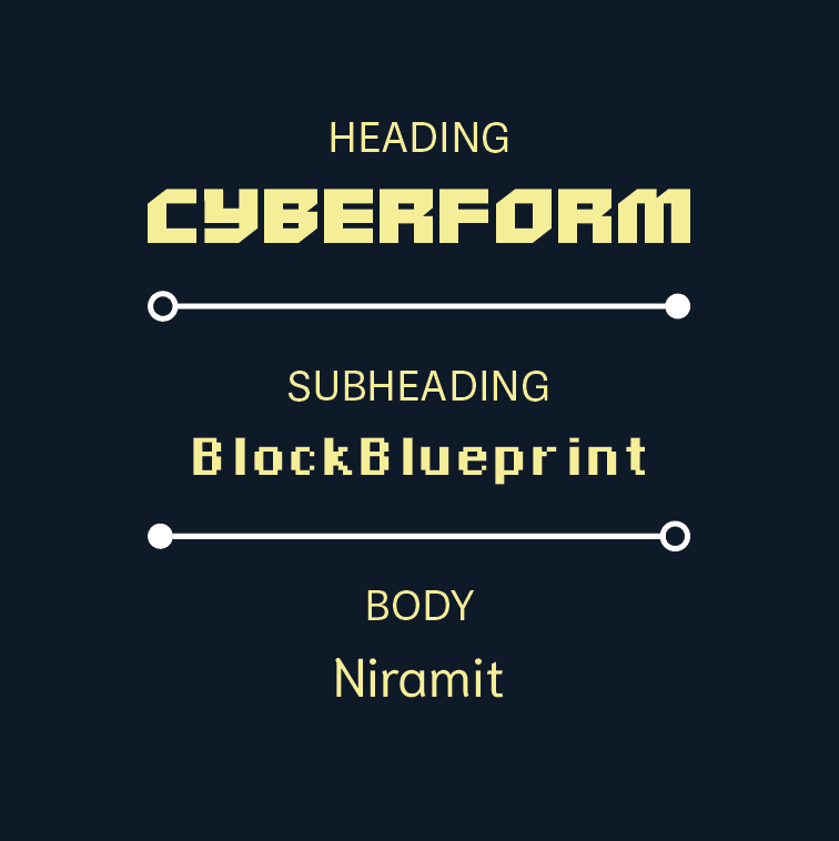
Color Theory and Palette
Primary color palette of blue, red, and yellow that incite a feeling of trust within the viewer.
Logo
Logo made up of a "6" and a lock to symbolize security.
Patterns
Pattern inspired by the wires within a computer chip to allude to the apps main goal: trust and security.
Transferable Design
A design that can be transfered from a mobile screen to a desktop screen.